Oct 14, 2025
How to Reduce Donor Drop-Off on Donation Pages
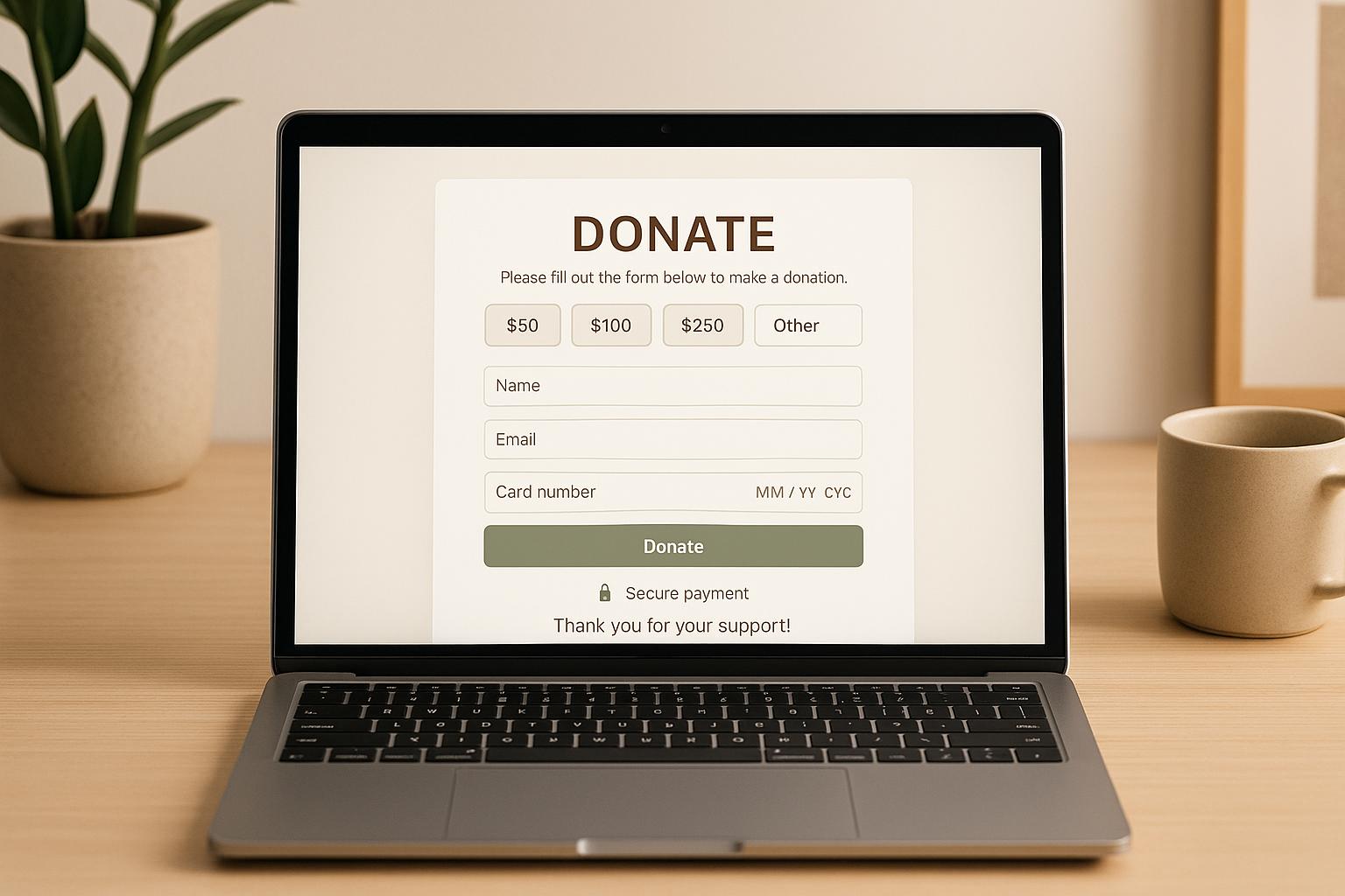
When people visit your donation page but leave without contributing, it’s a missed opportunity to support your cause. The average donor conversion rate is just 15%-17%, meaning over 80% of visitors don’t complete their donations. But you can fix this by simplifying forms, improving design, building trust, and personalizing the experience.
Key Tips to Reduce Donor Drop-Off:
- Simplify Forms: Fewer fields, logical order, and mobile-friendly design make donations easier.
- Offer Payment Options: Include methods like PayPal, Apple Pay, and ACH transfers.
- Optimize Page Design: Ensure fast load times, clean layouts, and mobile responsiveness.
- Build Trust: Use secure payment systems, SSL encryption, and display security badges.
- Test and Personalize: Run A/B tests to refine designs and tailor content to donor preferences.
By focusing on these areas, you can turn more visitors into donors and maximize your fundraising efforts.
Is Your Donation Page Leaking Donors? Here’s How to Fix It
Simplify Your Donation Form
The donation form is often the biggest hurdle between a donor's intent and completing their contribution. A complicated form can create unnecessary friction, discouraging donors from following through.
Reduce Form Fields
Too many fields lead to decision fatigue, making donors less likely to complete the process. Focus on collecting only the information that’s essential for processing the donation or that you’ll use immediately. For instance, if a billing zip code is enough, skip asking for the full address, phone number, or employer details.
To make things even easier, optimize your form for mobile devices by removing unnecessary fields. For returning donors, use your CRM to pre-fill their information, saving them from typing it in again.
Finally, ensure the fields are organized logically to make the process as smooth as possible.
Organize Field Order
The order of fields plays a huge role in whether donors complete the form. A logical, intuitive layout guides donors effortlessly, whereas a messy sequence can lead to confusion or abandonment. Start with the basics - like donation amount - then move to payment method and finish with minimal personal details needed to process the transaction.
Group related fields together, such as payment and donor information, to make the form feel more manageable. If you do need to ask for additional details, consider breaking the form into smaller steps. This “chunking” technique can make the process feel quicker and less overwhelming by presenting one task at a time.
After organizing your fields, the next step is to offer payment options that suit a variety of preferences.
Provide Multiple Payment Options
Giving donors multiple ways to pay can significantly boost completion rates. While credit and debit cards remain popular, adding digital wallets like PayPal, Apple Pay, and Google Pay can simplify the process by allowing donors to use saved payment details. For larger contributions, options like bank transfers or ACH payments are worth including.
Keep the interface clean and avoid overwhelming donors with too many choices. Highlight the most popular payment methods while still making others accessible. This way, donors can quickly find the option they’re most comfortable with - whether it’s a digital wallet or a more traditional method.
If you’re looking for expert help to optimize your donation page, consider working with specialists like Share Services. They provide tailored strategies for digital fundraising and donor retention, helping nonprofits create user-friendly, high-conversion donation forms.
Fix Donation Page Design and Performance
Once you've simplified your donation form, the next step is making sure your page design and performance keep donors engaged from start to finish. A clunky layout or a slow-loading page can undo all the hard work you've put into streamlining your form.
Mobile Optimization
With most web traffic coming from mobile devices, your donation page needs to work seamlessly on smartphones and tablets. If your page looks great on a desktop but falters on mobile, you risk losing donors who want to give while on the move.
Start by using a responsive design that adapts to different screen sizes. Make sure buttons are large enough to tap easily, with enough space between them to avoid accidental clicks. Test your page on various devices to ensure it performs well. Pay close attention to how smaller screens display the payment form - if fields are cramped or key buttons are hidden, donors might abandon the process.
Think about ergonomics, too. Place essential elements, like the "Donate Now" button, where users naturally hold their phones. This small adjustment can make a big difference in encouraging donations.
A mobile-friendly design ensures donors can complete their contributions anywhere, without distractions or frustrations.
Clean Design
A simple, fast-loading page builds trust and keeps donors focused on one goal: completing their gift.
Stick with a clean, uncluttered layout that uses plenty of white space. Remove unnecessary elements to minimize distractions. At the top of the page, feature your organization’s logo and a concise, engaging headline to immediately grab attention.
Use a button color that contrasts with your site’s primary color scheme to make it stand out. For example, if your website is mostly blue, an orange or green button will catch the eye. The button text should be clear and action-driven - "Donate Now" works well to prompt immediate action.
Consistency is key. Use a cohesive color palette that reflects your brand and clear typography that’s easy to read. Larger fonts should highlight key information, while smaller fonts can handle secondary details. Adding progress indicators, like a progress bar or a "Step 2 of 3" label, can reassure donors by showing them how close they are to completing their donation.
Faster Page Load Times
Even a slight delay in load time can hurt your conversion rates and cost you donations. A fast-loading page is essential to maintaining donor momentum.
Start by optimizing your images. Compress them and use modern formats that balance quality with smaller file sizes.
Minimize the use of plugins and third-party scripts on your donation page. Each additional feature can slow down loading times. If you rely on tracking pixels for advertising, set them to load asynchronously so they don’t block the main content.
Enable browser caching so returning visitors don’t have to reload files unnecessarily. This is especially helpful for donors who might revisit the page before making their gift.
Using a content delivery network (CDN) can also speed things up by serving your page’s assets from servers closer to your donors, reducing load times for users in different regions.
Regularly check your page speed with tools like Google PageSpeed Insights. Aim for a fast, responsive experience on both desktop and mobile, especially for donors with slower internet connections.
sbb-itb-deea482
Build Trust and Accessibility
A secure and accessible donation page is essential for earning donor trust and removing obstacles to giving. By prioritizing security and accessibility, you can reinforce the streamlined design and performance improvements discussed earlier, creating a seamless donation experience.
Use Secure Payment Systems
Security plays a critical role in building donor confidence. People need to trust that their personal and financial information is safe when they contribute to your cause.
- Ensure PCI compliance: This guarantees adherence to industry standards for credit card security. Most well-known payment processors, like Stripe, PayPal, or Square, handle PCI compliance for you, but it's always wise to confirm this before selecting a provider.
- Activate SSL encryption: Look for "https://" and the lock icon in your URL - this encryption protects sensitive data as it travels between the donor’s device and your server.
- Choose trusted payment processors: Platforms like Stripe and PayPal use advanced fraud detection and tokenization, replacing sensitive card data with unique tokens that are useless if intercepted.
- Display security badges: Prominently show logos from your payment processor, SSL certificate provider, or other security verification services. These badges reassure donors that their information is in safe hands.
- Add a security statement: A simple message like "Your donation is processed through our secure, encrypted payment system" can provide extra peace of mind without overwhelming the page.
- Implement two-factor authentication: Protect your admin accounts with an extra layer of security. Even if login credentials are compromised, this step helps block unauthorized access to donor data.
With these security measures in place, you can shift your focus to making your page accessible to everyone.
Ensure Accessibility
Accessibility isn’t just about meeting guidelines - it’s about ensuring everyone who wants to support your mission can do so easily. While the Americans with Disabilities Act (ADA) offers a framework, prioritizing accessibility benefits all users.
Here’s how to make your donation page more accessible:
- Screen reader compatibility: Use proper headings and include alt text for images to ensure that screen readers can interpret your page correctly.
- Keyboard navigation: Guarantee that users can navigate every part of your page using only a keyboard.
- High color contrast and clear fonts: Use contrasting colors and font sizes of at least 16px to ensure readability.
- Specific error messages: Provide clear feedback when users make mistakes on the form.
- Visible focus indicators: Highlight which element is selected when navigating with a keyboard, such as with a colored border or outline.
- Skip navigation links: Add links at the top of the page that allow users to jump directly to the main content or donation form, bypassing repetitive menus.
Test your page’s accessibility using tools like NVDA or JAWS to ensure it meets these standards. By addressing both security and accessibility, you create a donation page that’s welcoming, trustworthy, and easy to use for all.
Test and Personalize for Better Results
Once your donation page is streamlined and secure, the next step is to fine-tune it through testing and personalization. These strategies help align your page with donor preferences, keeping engagement high and reducing drop-offs.
Run A/B Tests
A/B testing is a powerful way to identify what works best on your donation page. This method involves comparing two versions of your page - a "control" (your current version) and a "variant" (a modified version) - to see which performs better at converting visitors into donors. Start by setting clear goals, like increasing conversion rates or average donation amounts, and formulating a hypothesis. For example: "Adding a clear value proposition at the top of the page will improve conversions because donors will immediately understand the impact of their contributions."
When creating your test, focus on changing one element at a time - this makes it easier to pinpoint what’s driving the results. Also, ensure your sample size is large enough to achieve statistically meaningful insights.
Here’s a striking stat: a strong value proposition can boost conversions by as much as 150%. For nonprofits, a successful A/B test typically improves results by 20-30%. If your test shows improvements above 50%, it might mean your original page was missing some key features. On the other hand, if your improvement is under 10%, your hypothesis or test may need adjusting.
Consider testing these elements on your page:
- Call-to-action button colors and text
- Suggested donation amounts
- Headlines and subheadings
- Images and videos
- Layout of form fields
- Payment method options
Keep in mind that today’s average adult attention span on a screen is just 47 seconds, down from two and a half minutes in 2004. Every detail matters when it comes to holding your audience’s attention.
Run each test long enough to gather meaningful data. When reviewing the results, don’t limit your analysis to conversion rates - look at metrics like average donation size and donor retention as well. Once you’ve optimized through testing, it’s time to take it a step further with personalization.
Add Personalization
Building on your testing insights, personalization can help you connect with donors on a deeper level. When donors feel seen and appreciated, they’re more likely to complete their donations and remain engaged with your cause.
Start with simple personalization strategies. Use donor data to customize greetings and acknowledge past contributions. For example, a message like "Thank you for your continued support, Alex!" can go a long way in making donors feel valued.
You can also tailor suggested donation amounts based on a donor’s previous giving history instead of using generic options. This makes the experience feel more relevant and could encourage higher contributions.
Geographic personalization is another effective approach. Highlighting how donations benefit local communities can foster a sense of connection. For instance, a message like, "Your gift helps families right here in Chicago," can create urgency and a stronger emotional tie.
Timing-based personalization is equally useful. First-time visitors might respond well to messaging focused on your organization’s mission and impact, while returning donors may appreciate updates on programs they’ve supported in the past. Additionally, use donor behavior - such as recently viewed programs - to customize their experience further.
Experiment with both emotional and data-driven personalization to make your page feel relevant without coming across as intrusive. The goal is to create a donation process that feels meaningful and seamless, helping to minimize drop-offs while strengthening donor relationships.
Conclusion: Key Steps to Reduce Donor Drop-Off
Reducing donor drop-off on donation pages means paying attention to every stage of the donor experience. Start by simplifying form fields and organizing information clearly. Offering multiple payment options ensures you cater to different donor preferences, making the process smoother for everyone.
A fast, mobile-friendly, and visually clean design keeps donors focused on completing their contributions. Prioritizing performance across all devices helps maintain momentum and reduces the chances of donors abandoning the process midway.
Building trust and ensuring accessibility are essential for successful donation pages. Strong security measures protect donor information, while accessibility features make it possible for everyone to support your cause. These two elements create a safe and inclusive environment that encourages donors to complete their transactions. Once these basics are in place, you can fine-tune your approach with testing and personalization.
Testing and personalization are powerful tools for boosting engagement. A/B testing helps pinpoint which design elements and messaging work best, while personalization makes donors feel valued and connected to your mission. Every detail on your page should work together to keep donors engaged and motivated.
By combining streamlined forms, optimized design, strong security, and personalized experiences, you can significantly improve donor conversion rates. This integrated approach ensures that all elements work together seamlessly. The key is to implement these strategies thoughtfully and continuously refine them based on donor feedback and behavior.
For nonprofits ready to put these strategies into action, Share Services provides customized digital fundraising and donor retention solutions. Designed for organizations with revenues between $1–$20M, their expertise in donor retention and conversion optimization can help you implement these practices effectively while shaping a broader fundraising strategy to support your mission's growth.
FAQs
What are the most important fields to include on a donation form to keep donors engaged?
To keep donors interested and prevent them from abandoning the process, stick to the basics on your donation form. The key fields to include are the donor's name, email address, payment details, and the donation amount. Asking for too much information can feel overwhelming and might discourage people from completing their donation.
Another way to enhance the experience is by breaking the process into easy-to-follow steps. Adding progress indicators can show donors how close they are to finishing, which helps keep them motivated. By keeping the form straightforward and cutting out unnecessary options, you make the process quicker and more pleasant - giving donors more reason to complete their contribution.
How can I personalize the donation process to keep donors engaged and encourage repeat contributions?
Making the donation process feel personal is a powerful way to keep donors engaged and encourage long-term support. A great starting point is acknowledging their past contributions and emphasizing the real-world impact of their generosity. When donors see how their support has made a difference, it reinforces their connection to your cause.
Another way to strengthen this bond is by sharing stories or updates that align with their passions or interests. Whether it’s a success story, a progress update, or a heartfelt thank-you, these personalized touches create a deeper emotional connection.
Your donation pages also play a big role. Incorporate your organization’s branding and include personalized messages or tailored content to make the experience more meaningful. These small but thoughtful details show donors they’re appreciated and can make them more likely to give again. In the end, it’s about building relationships that last.
Why are mobile optimization and fast load times important for increasing donor conversions on donation pages?
Mobile optimization and fast load times play a key role in boosting donor conversions by ensuring a smooth and user-friendly experience - especially since more than half of online donations now come from mobile devices. When pages load quickly, they minimize frustration and reduce the chances of potential donors abandoning the process. Even a slight delay of a few seconds can have a noticeable impact on conversion rates.
A mobile-friendly design makes donation forms simple to navigate, creating a better overall experience that encourages donors to complete their contributions. It also helps establish trust and can inspire repeat donations, which are essential for sustaining nonprofit fundraising efforts over time.
Related Blog Posts
Get helpful resources, straight to your inbox
We love sharing tools, ideas, and stories that make nonprofit work a little lighter and a lot more effective. Sign up below and we’ll send you practical tips, free resources, and a bit of encouragement—because the work you’re doing matters.
No spam. Just good stuff for good people.