Jan 16, 2026
How to Optimize Donation Pages for Recurring Giving
Nonprofit donation pages often face high abandonment rates (50-70%), but optimizing for recurring giving can significantly improve donor retention and revenue. Recurring donors retain at over 80% in the first year and 95% by year five, contributing 42% more annually than one-time donors. To maximize recurring donations:
- Simplify the donation process: Reduce unnecessary form fields and clicks to lower abandonment rates.
- Emphasize recurring options: Set monthly giving as the default and highlight its impact.
- Build trust: Use consistent branding, secure payment icons, and mission-focused content.
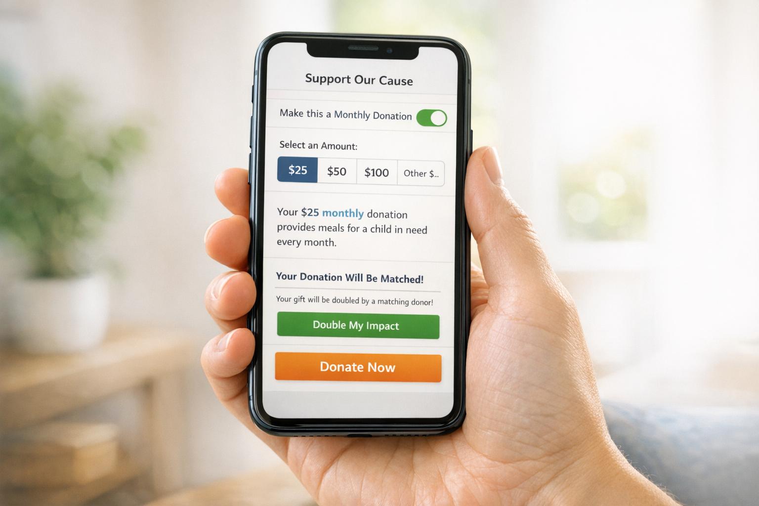
- Show impact: Connect donation amounts to tangible outcomes, like "$25/month feeds five families."
- Optimize for mobile: Ensure mobile-friendly design with fast load times and easy payment options.
- Leverage technology: Add matching gift tools and personalize donation experiences using donor data.
- Test and refine: Use A/B testing to improve conversion rates and donation amounts.
These strategies turn your donation page into a reliable tool for building long-term donor relationships by implementing a donor welcome series and boosting recurring contributions.

Recurring Donor Impact Statistics and Donation Page Optimization Results
Best Donation Page Optimizations For Nonprofits | Webinar Video
sbb-itb-deea482
Build Trust Through Branding and Mission-Focused Design
Your donation page should feel like an extension of your nonprofit's main website. If it looks disconnected, donors may hesitate or abandon the process altogether. By maintaining consistent branding - your logo, colors, and fonts - you reassure donors and create a sense of trust. This trust is crucial for encouraging sustained and recurring contributions.
"Trust greatly influences a donor's willingness to give, which is one reason your donation page should highlight your nonprofit's branding. Reinforcing brand recognition instills trust in donors because your brand is the core of your nonprofit's identity."
- Doubleknot Support
Make your mission the focal point of your page. Clearly answering the question, "Why give to you?" can have a big impact. Mission-driven copy has been shown to boost donations by 150%, while specific details about how funds are used can increase conversion rates by 69%. When your donation page aligns with your mission, it becomes a trusted gateway for recurring giving.
Use Consistent Branding Elements
Small design changes can make a big difference. For instance, removing navigation links and external buttons increased donations by 195%. Swapping out generic images for mission-related visuals saw a 53.1% boost in donations.
Here’s how to strengthen your branding:
- Display your logo prominently on the page.
- Stick to your nonprofit's primary and secondary color palette to reinforce authenticity.
- Add security icons near payment fields to ease concerns - this simple step can increase conversions by 20%.
Connect Recurring Gifts to Your Mission
Recurring giving isn’t just about monthly donations - it’s about building a community. Give your program a name and identity that makes donors feel like they’re part of something larger. For example, The Adventure Project named their initiative "The Collective", creating a dedicated page that highlighted over 400 members and fostered a sense of belonging.
"Your recurring donors are more than supporters: They're a dedicated community investing in your mission. Make them feel special by giving your program a unique name, visual identity, and story."
- Korrin Bishop, GoFundMe Pro
Take it a step further by linking recurring donations to specific, tangible outcomes. Use impact tiles to show how donation amounts translate into real-world results. For example, instead of just saying "$25/month", explain that "$25 provides a week of food for five families". The Lucile Packard Foundation used this strategy in their "Making Futures Bright" campaign in November 2024, achieving a 44% year-over-year increase in funds raised and a 44% higher average gift amount.
If you’re aiming to enhance your donation page, Share Services offers customized marketing and fundraising solutions designed to prioritize brand consistency and mission-driven design, helping you secure recurring support.
Make Recurring Giving the Primary Choice
To encourage long-term support, design your donation page with a focus on recurring giving. A simple adjustment, like using a tabbed donation form to separate monthly and one-time donations, can lead to a 15% increase in donations.
Take WWF as an example: they set the monthly donation option as the default. If a user selects "Give Once", a pop-up message appears, accompanied by an arrow pointing back to the monthly option. The message describes recurring donors as "heroes for nature 365 days a year", emphasizing the ongoing impact of their contributions. This subtle nudge encourages donors to commit long-term while still offering flexibility.
Feature Recurring Options Prominently
Just as consistent branding builds trust, clear and thoughtful design choices can shape donor behavior. Set the monthly donation option as the default and use visual elements like a "Most Popular" badge or standout colors to draw attention to it.
To make recurring giving even more appealing, adjust donation tiers. For example, suggest lower amounts for monthly gifts - like $10, $25, or $50 - while keeping higher tiers, such as $50, $100, or $250, for one-time donations. A $10 monthly donation, which adds up to $120 annually, feels more manageable than a one-time $100 gift. Showing these options side by side helps donors realize how smaller, regular contributions can make a larger impact over time.
Show Impact to Encourage Monthly Donations
Tie each donation level to a specific result to strengthen the connection between giving and your mission. Instead of simply listing "$20/month", reframe it as "$20/month feeds 5 families". This approach not only personalizes the donation but also makes the impact tangible.
For instance, the Irish International Immigrant Center (IIIC) saw their average donation increase by $100 after introducing customized tiers with clear impact statements in 2019. Plus, recurring donors tend to give 42% more annually than one-time donors. By showing how each contribution directly supports your cause, you can build stronger, more lasting relationships with supporters.
Streamlining the donation process even further can help maximize these recurring contributions.
Reduce Friction in the Donation Process
Extra clicks, unnecessary fields, or confusing decision points often lead to donor abandonment. Nonprofit donation pages experience abandonment rates as high as 70%. With attention spans growing shorter, simplifying the process is critical to keeping donors engaged.
Focus on removing anything that doesn’t directly contribute to completing the donation. A streamlined donation page can make all the difference. For instance, one organization removed intermediate verification screens and saw a 121% increase in completed donations. This highlights how even minor adjustments can significantly impact recurring giving. Simplicity and clarity not only reduce friction but also build donor confidence.
Keep Forms Short and Simple
Only ask for the information you absolutely need to process the donation. Every additional field increases the chance of abandonment. For example, requiring a phone number can reduce conversions by 42.6%. If it’s not essential, make it optional - or better yet, remove it entirely.
Use a single-step form that displays all fields on one page instead of breaking them into multiple steps. Multi-step forms can be a major roadblock, with each additional screen reducing conversions by up to 52%. Group related fields like "Personal Information" and "Payment Details" to make the process more intuitive. Tools that auto-fill city and state based on ZIP codes can also save donors time and effort. Implementing these changes can increase conversions by as much as 39.4%. A clean, concise form not only simplifies the process but also ensures a smoother mobile experience.
Design for Mobile Devices
Since over half of nonprofit website traffic comes from mobile devices, optimizing your donation page for smartphones and tablets is non-negotiable. The Salvation Army, for example, introduced digital wallet options like Apple Pay and Google Pay on their mobile donation pages, leading to a 246% year-over-year increase in mobile donation revenue. These one-tap payment methods eliminate the hassle of entering credit card details on small screens.
To enhance the mobile experience, use large, easy-to-tap buttons - especially for features like recurring giving toggles - and stick to a single-column layout that’s simple to navigate. Ensure the correct keyboard appears for each input field, such as numeric keyboards for ZIP codes and donation amounts, and standard keyboards for names and emails. The Atlanta chapter of Habitat for Humanity optimized their page for mobile users, cutting page load times by 65% and boosting mobile engagement by 55%.
Use Technology to Improve the Donor Experience
Technology can turn donation pages into more than just a place for transactions - it can create personalized experiences that encourage ongoing support. By simplifying the process, building trust, and showing donors the impact of their contributions, smart tools make giving more engaging and rewarding. Let’s dive into how matching gift tools and donor data can elevate the experience.
Add Matching Gift Lookup Tools
Matching gift programs have the potential to double a donor's contribution, but about 78% of eligible donors don’t know their employer offers matching gifts. Adding a lookup tool like Double the Donation makes it easy for donors to search for their employer and discover matching opportunities right on the donation page. Placing this tool prominently ensures donors see its benefits right away.
"Matching gifts are standout corporate giving programs offered by thousands of companies that match employees' gifts to charitable causes." - Adam Weinger, President, Double the Donation
When donors see that their recurring contributions could be matched, they’re often more motivated to commit to regular giving. Some nonprofits even take it a step further by collecting employment details during the donation process. This allows them to identify matching opportunities and follow up with donors directly.
Personalize Using Donor Data
Technology also allows nonprofits to create a seamless and tailored donation experience by leveraging donor data. Tools like SmartGive can pre-fill information for returning donors, cutting down on effort and increasing completion rates. For example, one nonprofit using DonorPerfect’s CRM integration saw an over 100% increase in online donations after automating its data sync.
But personalization doesn’t stop there. Donor history can be used to suggest customized giving amounts. Instead of showing the same options to everyone, tailor the suggested amounts based on past contributions. This not only encourages higher donations but also avoids unintentionally suggesting lower amounts. By using the "anchoring effect", nonprofits can nudge donors toward higher monthly commitments.
Additionally, segmenting donor lists ensures targeted upgrade prompts are sent to one-time donors rather than existing recurring supporters. This thoughtful approach helps convert occasional contributors into long-term supporters, creating a more sustainable donor base.
Test and Improve Based on Data
Refine your donation page using A/B testing to uncover what drives recurring donations. This method allows you to compare two versions of your page - the original "Champion" and a modified "Challenger" - so you can implement changes with minimal risk. If a modification underperforms, you can quickly revert to the original version.
"The beauty of A/B testing lies in its ability to minimize the risks of changes that could backfire, ensuring every tweak is data-driven and impactful." - Adam O'Brien, iDonate
Once you identify the better-performing version, it becomes your new baseline for future improvements. Here’s what to focus on when testing elements to boost recurring donations.
Run A/B Tests on Key Elements
Start by testing factors like setting "Monthly" as the default donation option or experimenting with suggested gift tiers. While these changes might reduce short-term revenue, they often lead to higher long-term gains. You can also test the order of donation amounts or highlight options like a "Most Popular" tier. For example, Americans for Prosperity added a "Most Popular" label to a pre-selected $100 option, which led to a 94.4% revenue increase, especially among mobile users.
Experiment with button text and value proposition copy to see what resonates most with donors. Prison Fellowship International, for instance, added detailed language explaining how donations would be used, resulting in a 68.7% increase in contributions. Even small adjustments like placing a value-driven sentence directly below the "Donate" button can make a big difference - one study saw a 42% boost in donations from this change.
Track metrics like conversion rates, average gift size, and total revenue to measure the impact of these tweaks.
Use Performance Data to Make Changes
Let the data from your A/B tests guide your decisions. If form completion rates are low, look at simplifying unnecessary fields. Also, consider the behavior of donors based on their traffic source - those arriving via email campaigns may respond differently than those from social media. Tailoring the page to specific audience segments can lead to better outcomes.
For example, in late 2024, Fundraise Up conducted an A/B test with 1.6 million visitors to evaluate a new AI model for suggesting recurring donation amounts. The test resulted in a 4.57% increase in the average recurring gift size but also led to a 2.88% drop in the recurring conversion rate. This highlights the importance of monitoring multiple metrics since improving one area can sometimes negatively affect another.
"Accurate tracking is crucial for an effective A/B test - you can't optimize what you can't measure." - iDonate
Run tests for at least one week to capture a full cycle of donor behavior, but avoid extending them beyond eight weeks to prevent skewed data. Make sure to reach statistical significance before declaring a winner; this ensures your results reflect actual improvements rather than random variations. By consistently analyzing and implementing data-driven updates, you can keep your donation page optimized for long-term donor engagement.
Conclusion
To make your donation page truly effective, focus on consistent branding, easy-to-navigate forms, clear recurring donation options, and data-driven testing. Even small tweaks can lead to noticeable revenue increases. Recurring donors, for instance, give 42% more annually than one-time donors, highlighting the value of these adjustments.
These efforts turn your donation page into more than just a transaction tool - it becomes a meaningful way to engage and inspire donors.
"Your donation page is more than a transaction point - it's an opportunity to inspire and engage donors." - Adam O'Brien, iDonate
Regularly reviewing and refining your page is essential to maintaining strong conversion rates and reducing donor attrition. Use your CRM to identify at-risk donors, address payment issues, and tailor communications. Keep an eye on metrics like conversion rates and average gift size to identify and address potential weaknesses before they affect your fundraising.
For nonprofits looking for specialized guidance, Share Services provides digital fundraising solutions designed for organizations with revenues between $1 million and $20 million. Their expertise spans donation page design, conversion optimization, donor retention strategies, and recurring giving programs. With structured support that includes strategy sessions, project management, and KPI reporting, Share Services helps nonprofits transform one-time donors into loyal, long-term supporters.
FAQs
What’s the best way to simplify donation pages and reduce drop-offs?
To lower abandonment rates and improve the effectiveness of donation pages, it's crucial to focus on creating a smooth and user-friendly experience. Here’s how to make that happen:
- Stick to the basics: Only request essential details like the donor’s name, email address, donation amount, gift type (one-time or recurring), and payment information. Extra fields can frustrate donors and lead to drop-offs.
- Provide pre-set donation options: Offer clickable amounts like $25, $50, or $100 to save donors time. Add a custom amount field for those who prefer flexibility.
- Simplify recurring donations: Include an easy-to-spot checkbox or toggle labeled “Make this a monthly gift” near the donation amount to encourage ongoing contributions.
- Eliminate distractions: Keep the page clean and focused. Remove unnecessary navigation links or clutter, and use a direct headline like “Support Our Mission Today” to guide donors toward completing their gift.
- Optimize for mobile and autofill: Ensure the page works seamlessly on all devices and supports autofill to make the process quick and hassle-free.
By streamlining the donation process, you make it easier for donors to complete their contributions, increasing the chances of both one-time and recurring gifts. Share Services specializes in designing donation pages that help nonprofits grow donor support and long-term engagement.
What are the best ways to encourage recurring donations on my donation page?
To encourage recurring donations, make the option easy to find and simple to use - a checkbox or toggle works well. Suggest manageable monthly amounts, such as $25 or $50, and use messaging that highlights the lasting impact of ongoing contributions. Focus on how their support creates meaningful change over time.
Show gratitude by sending personalized thank-you notes and occasional updates that demonstrate the difference their donations are making. Keep donors engaged by reminding them about renewal opportunities and reinforcing the value of their continued support.
How can I use technology to improve donation pages and boost recurring contributions?
Technology has the power to turn donation pages into smooth and engaging experiences that inspire supporters to give regularly. Start by making monthly donation options stand out - place a clear checkbox or toggle prominently near the top of the page. Include suggested monthly amounts, such as $25, $50, or $100, to make the decision process easier for donors. A simple, distraction-free layout - like a single-column design without navigation links - can boost conversions. And don’t overlook mobile optimization; with over 45% of online donations now coming from smartphones, ensuring your page works seamlessly on smaller screens is a must.
To deepen donor connections, integrate your donation page with a donor management platform. This allows you to track donor behavior and personalize the experience, whether it's by showcasing compelling impact stories or highlighting matching-gift opportunities. Automating key tasks like recurring billing, receipt emails, and renewal reminders can help retain donors and reduce churn. By blending thoughtful design, data insights, and automation, you can transform one-time contributors into loyal monthly supporters, creating a steady and reliable foundation for your cause.
Related Blog Posts
Get helpful resources, straight to your inbox
We love sharing tools, ideas, and stories that make nonprofit work a little lighter and a lot more effective. Sign up below and we’ll send you practical tips, free resources, and a bit of encouragement—because the work you’re doing matters.
No spam. Just good stuff for good people.